Finding a School is stressful Easy
with Better School mobile app.
Searching for school is a complex process with several steps. Parents start their search with clear goals and limitations, but struggle finding schools due to complex apps & lack of centralized resources.
Problem
Design competitive features to facilitate parent’s research and school application process.
Goal
Overview
Role:
UX/UI Designer
Insights from participants, mentor, and peers were key.
Duration:
2 weeks
Tools:
Figma
Deliverables:
Affinity diagram
Empathy map
Competitive analysis
User persona
Usability test
Design system
Hi-fi prototype
Discovering
Parents have common goals and challenges when looking for schools
Synthesizing parents interviews
Sample size: 6 Interviews
Affinity Diagram
Goal:
Find a school that fits their values and child’s personality.
Limited resources and constraints such as budget and commuting time affects the research.
Challenge:
Emotions:
Feeling welcomed and supported is crucial.
Research involves several steps and varies for each parent. Some of them don’t know where to start.
Process:
Empathy Map + Feature Prioritization
Then, I connected parents' goals and challenges to feasible features.
Insights to parents pain points gave me a better understanding of parents objectives and challenge during their research process:
Competitive Analysis
Niche is the strongest competitor, with advanced filtering capabilities and detailed school profiles. But, it can be confusing with excessive information.
I've created a list of features that must be included to compete with other brands.
Map View
Table View
Favorite List
Compare Button
School Reviews
Features to add:
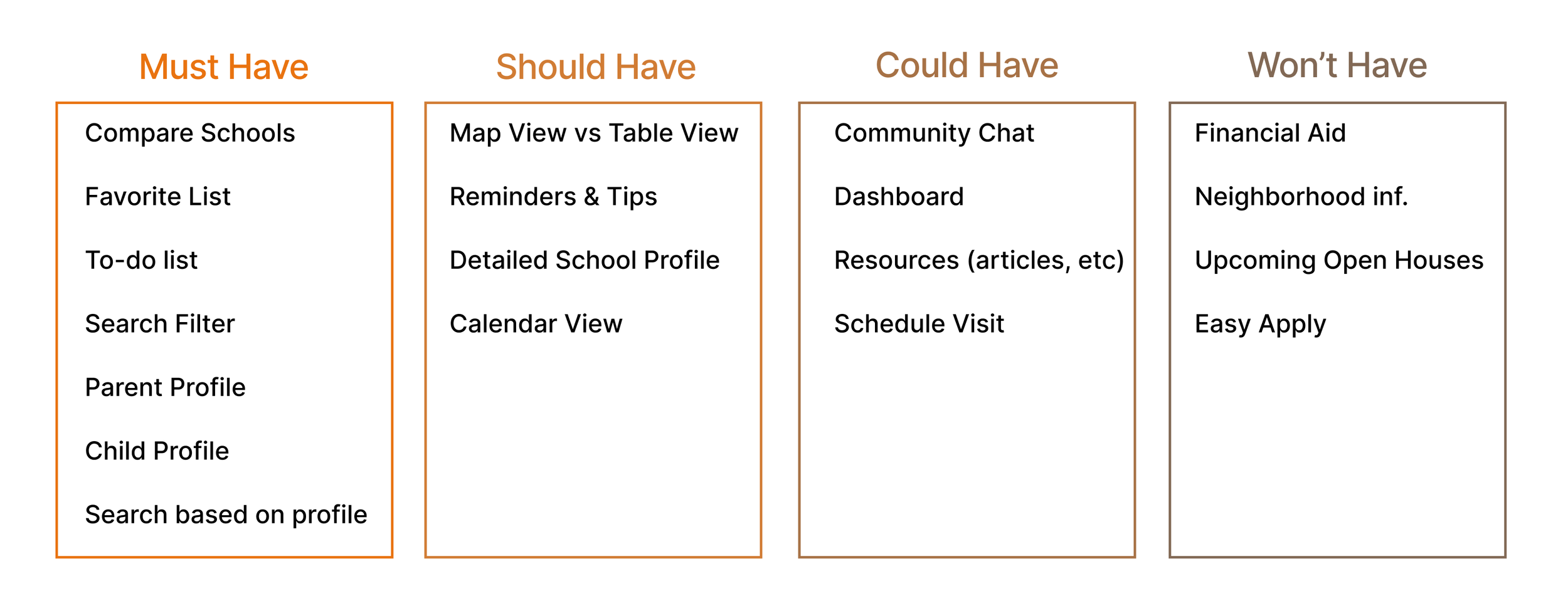
MoScoW
I first classified features using this method to decide the focus of the usability test and user flows suitable for testing. Then, decided that Child profile and To-do List were worth exploring.
These features seemed beneficial to both users' and business' goals, creating a competitive advantage over other companies.
Jobs To Be Done
I placed myself in parents’ shoes to understand when these features would be helpful.
When I know my child’s strengths and weaknesses
I want to narrow down my search
to only see schools that match my child’s abilities.
Child Profile:
When I’m overwhelemed & unsure how to start
I want to write everything down
to organize myself and be productive.
To-do List:
Defining & Ideating
Evaluating top-notch features
Are these features easy to use, efficient, and engaging?
to-do lists “they dampen anxiety about the chaos of life; they give us a structure, a plan that we can stick to”
Dr. David Cohen
Child Profile Benefit:
save time filtering school search based on child’s characteristics and interests.
To-do List Benefit:
boost productivity and keep track of school application.
Crazy 8’s & User Flow Diagram
When designing the navigation, I focused on the parents' experience setting a profile, searching schools, and creating tasks. My goal was to design intuitive user flows that give parents flexibility and control when interacting with the app by being able to change between map and list view when looking at search results or access essential features like to-do from the bottom navigation bar and home page.
Lo-Fi Prototype
Mothers lead the research process
They make decisions based on their values, limitations, and child’s personality
In this app, the user will first create a profile with their personal values, priorities, and child profile to facilitate the search process, automatically filtering the search based on their profile.
“Once you figure out what's important to you, the choices start to narrow down.”
Parent Interview
Research Goals
After choosing the features to be tested, I planned the usability test with clear objectives.
Testing
2 out of 3 goals were met, let’s analyze!
Understanding research insights
To-do list is an asset, but the interface must be simplified.
Research Insight 1:
67% of users did not complete the second scenario, failing the efficiency goal. However, when evaluating the satisfaction goal and looking at insights, users described this app as useful!
“The task list was very useful, you can write notes have them when you need them”
Research Participant
Icon Sizes are too small and must be edited.
Even though 67% of users completed the first scenario, the average number of attempts surpassed my approximation by 17 clicks, pointing to an issue with the icons and button sizes.
Research Insight 2:
Delivering
User-friendly interface with advance organization tools and filtering capabilities.
“Being able to search, set tasks, save, review schools, and organize myself all in one place...It’s all in one solution”
Research Participant
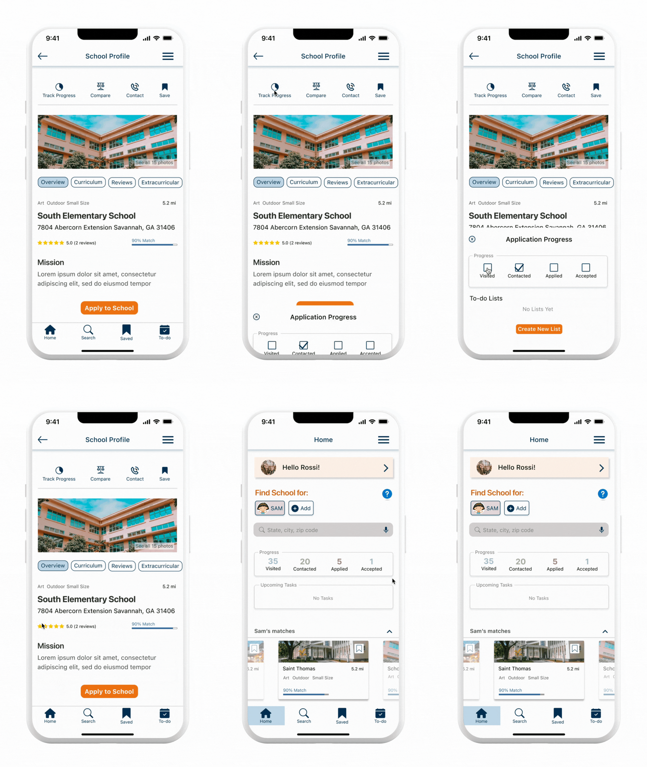
This high-fidelity prototype simplifies parents' research process, providing a centralized database with advanced filter capabilities and organizational tools.
App Features
1. Search for school choosing a child profile and filter tool
2. Choose from template or
create to-do list
3. Keep track of application progress
Reflecting
Turning data into stories
A closer look into user flows and understanding research
by spending more time on the user flow and breaking down the user steps I could have designed an easier interface for the to-do list. Good thing that testing is part of the design process!
1) Take your time, every step matters:
2) Use qualitative and quantitative data to build the complete story:
I could've eliminated the to-do list feature by only looking at the results of task completion rate, but when reading insights I discovered that users considered this feature "useful," it just needed an easier interface.


